| Title: | The Cell Bar Chart: A Density-Aware Overlay for Bivariate Data |
| Author: | Vincenzo Manto |
| Date: | |
| Link: | https://datastripes.com/ |
The Cell Bar Chart: A Density-Aware Overlay for Bivariate Data
Abstract
The Cell Bar Chart is a hybrid bivariate visualization designed to reduce overplotting while preserving point-level interpretability. The method overlays a density-encoded bar layer onto a conventional scatter plot. Unlike approaches that fully aggregate observations into bins, the Cell Bar Chart keeps individual observations visible and adds a local frequency signal in the same frame of reference. This article formalizes the method, details its algorithmic construction, and discusses practical usage patterns, implementation parameters, and limitations.
1. Introduction
Scatter plots are the default instrument for visualizing relationships between two continuous variables. Their interpretability degrades, however, as sample size increases and point overlap grows. In dense regimes, the visual field saturates and local structure is obscured.
Common alternatives partially address this issue but introduce trade-offs:
- Alpha blending eventually saturates under very high overlap.
- Heatmaps and 2D histograms expose density but hide individual observations.
- Hexbin methods impose geometric quantization that can reduce continuity perception.
- Marginal distributions require cross-panel integration by the reader.
The Cell Bar Chart was introduced to combine the strengths of point-level and density-level representations in one synchronized coordinate space.
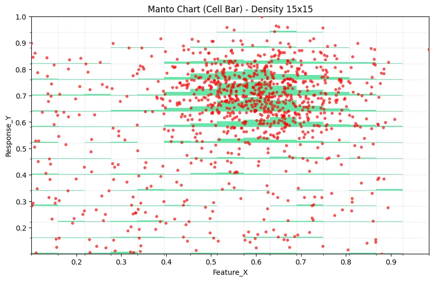
2. Method Overview
The method consists of two superimposed layers.
2.1 Scatter Layer
All observations are rendered in a standard scatter field, preserving outliers, local trend shape, and point-wise variability.
2.2 Density Bar Layer
The plot domain is partitioned into cells on the X axis (and optionally Y axis for fine-grained cell occupancy). For each cell, local frequency is estimated and mapped to a vertical bar whose height is proportional to relative occupancy.
This creates a local density signal without removing individual observations from view.
3. Formal Construction
Given a dataset with and :
- Partition the X domain into cells with boundaries .
- Optionally partition Y into cells for 2D occupancy accounting.
- Compute cell counts for each occupied cell.
- Let .
- Map each count to bar height
where and is a scaling factor (typically ).
Bars are then rendered from the lower bound of each cell with semi-transparency so both layers remain visible.
4. Reference Python Implementation
import pandas as pd
import numpy as np
import matplotlib.pyplot as plt
import matplotlib.patches as patches


def create_cellbar_chart(df, x_col, y_col, n_cells=15, max_points=2000, bar_alpha=0.6):
    """
    Generate a Cell Bar Chart combining scatter and density visualization.

    Parameters:
    -----------
    df : DataFrame
        Input data
    x_col : str
        Column name for X-axis
    y_col : str
        Column name for Y-axis
    n_cells : int
        Number of cells (bins) along X-axis
    max_points : int
        Maximum scatter points to display (for performance)
    bar_alpha : float
        Transparency of density bars (0-1)
    """

    # Clean and prepare data
    data = df[[x_col, y_col]].apply(pd.to_numeric, errors="coerce").dropna()
    if data.empty:
        raise ValueError("No valid data after cleaning")

    # Calculate data bounds
    x_min, x_max = data[x_col].min(), data[x_col].max()
    y_min, y_max = data[y_col].min(), data[y_col].max()

    # Create bins
    x_bins = np.linspace(x_min, x_max, n_cells + 1)
    y_bins = np.linspace(y_min, y_max, n_cells + 1)

    # Assign each point to a 2D bin
    data["x_bin"] = pd.cut(data[x_col], bins=x_bins, include_lowest=True, labels=False)
    data["y_bin"] = pd.cut(data[y_col], bins=y_bins, include_lowest=True, labels=False)

    # Calculate density
    density = data.groupby(["x_bin", "y_bin"]).size().reset_index(name="count")
    max_density = density["count"].max()

    # Cell dimensions
    cell_width = (x_max - x_min) / n_cells
    cell_height = (y_max - y_min) / n_cells

    # Sample data for scatter if needed
    scatter_data = data.sample(n=min(len(data), max_points), random_state=42)

    # Create plot
    fig, ax = plt.subplots(figsize=(12, 7))

    # Draw density bars
    for _, row in density.iterrows():
        x_idx = row["x_bin"]
        y_idx = row["y_bin"]
        count = row["count"]

        # Calculate bar height (90% of cell height max)
        bar_height = (count / max_density) * cell_height * 0.9

        # Position rectangle from bottom of cell
        x_pos = x_min + x_idx * cell_width
        y_pos = y_min + y_idx * cell_height

        # Draw density rectangle
        rect = patches.Rectangle(
            (x_pos, y_pos),
            cell_width,
            bar_height,
            linewidth=0,
            facecolor="#00d86f",
            alpha=bar_alpha,
            zorder=1,
        )
        ax.add_patch(rect)

    # Overlay scatter plot
    ax.scatter(
        scatter_data[x_col],
        scatter_data[y_col],
        color="#ff4444",
        s=15,
        alpha=0.7,
        label=f"Data Points (n={len(scatter_data):,})",
        zorder=5,
    )

    # Styling
    ax.set_xlim(x_min, x_max)
    ax.set_ylim(y_min, y_max)
    ax.grid(True, alpha=0.3, linestyle="--")
    ax.set_xlabel(x_col, fontsize=12)
    ax.set_ylabel(y_col, fontsize=12)
    ax.set_title(f"Cell Bar Chart: {x_col} vs {y_col}", fontsize=14, fontweight="bold")
    ax.legend(loc="upper right")

    return fig, ax


# Example synthetic dataset
np.random.seed(42)

cluster_x = np.random.normal(0.5, 0.08, 800)
cluster_y = np.random.normal(0.6, 0.08, 800)

background_x = np.random.uniform(0, 1, 400)
background_y = np.random.uniform(0, 1, 400)

x_data = np.concatenate([cluster_x, background_x])
y_data = np.concatenate([cluster_y, background_y])

x_data = np.clip(x_data, 0, 1)
y_data = np.clip(y_data, 0, 1)

df = pd.DataFrame({"Variable_X": x_data, "Variable_Y": y_data})

fig, ax = create_cellbar_chart(df, "Variable_X", "Variable_Y", n_cells=20)
plt.tight_layout()
plt.show()
5. Practical Use Cases
5.1 Confidence-Aware Trend Reading
Trends in the scatter layer can be weighted visually by local bar heights, distinguishing high-support regions from sparse regions.
5.2 Segmented Modeling and Policy Design
When decision boundaries or bins are relevant (for example, customer scoring, pricing bands, or temporal regimes), the overlay reveals where sample mass is concentrated.
5.3 Pattern Discovery in Apparent Uniformity
Data that appears diffuse in a scatter-only representation can reveal concentration corridors once density bars are superimposed.
5.4 Quality and Process Monitoring
Outliers can be interpreted in context: anomalies in dense regions may indicate systemic shifts, while anomalies in sparse regions may be artifacts.
6. Design Guidelines
- Cell count should typically begin in the 15 to 20 range, then be tuned against distribution complexity.
- Bar transparency should remain in the 0.5 to 0.7 range to preserve visibility of underlying points.
- For very large datasets, subsample only the scatter layer and compute density on the full dataset.
- Use subtle grid lines aligned to bins when bin structure needs to be visually explicit.
7. Limitations
- The method is most effective for continuous-continuous variable pairs.
- Extremely sparse datasets may not justify a density layer.
- Binning introduces controlled discretization and may smooth fine local structure.
Potential extensions include adaptive bin widths, interactive tooltips with exact per-cell counts, class-conditioned bar coloring, and trivariate generalizations.
8. Conclusion
The Cell Bar Chart offers a practical middle ground between point-wise and aggregate bivariate visualization. By combining scatter fidelity with local density encoding in one coordinate frame, it reduces cognitive load in dense-data interpretation and supports more reliable visual inference under overplotting conditions.
9. Citation and Naming
In Datastripes contexts, this method is also referred to as the Manto Chart. For external communication, the term Cell Bar Chart is recommended for descriptive clarity.